
Roskilde Festival Food App
Client
Role
UI Design, Wireframing, Prototype Design, UX Research, User Testing, and Data Mining.
Team
Jonas Muchardt-Pind
Christoffer Koborg
Laura Sommer
Michala Rose
Sofie Juhl
Methods
Qualitative Interviews, Usability Testing, Wireframing, Information Architecture, Design Thinking, and SCRUM.
The Challenge
The Roskilde Festival takes place once a year, and its guests are primarily engaged during the 8 days of the festival. Roskilde Festival wanted to provide more value to their guests through a digital universe. The festival needed a concept that could be easily implemented and had a simple and quick onboarding process.
We asked ourselves the following question:
How can Roskilde Festival increase the value for their guests through a digital universe, and how can we simultaneously enhance the uniqueness of the festival experience?
The Solution
Less queue = more festival
The concept we arrived at revolves around people spending less time in lines for food stalls and more time experiencing culture, music, and enjoying the festival.
This is realized through a food ordering app, familiar to most, where attendees can order food and drinks from the festival’s food and beverage stalls. If one knows in advance what they want, they can place an order well in advance and pick up the food when it’s ready. This minimizes the queue time as much as possible, but attendees can also order food at the stall as usual or by using the app.
Sustainability at the forefront
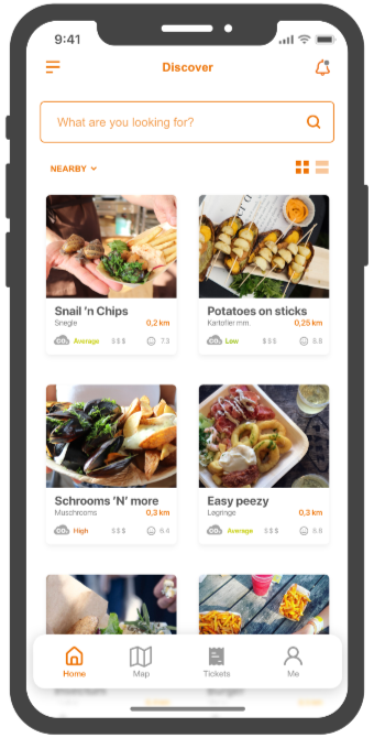
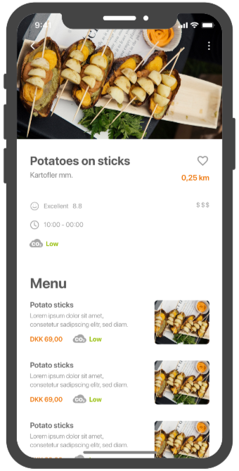
In the app, there will be a focus on the environmental footprint of individual dishes, providing an incentive for food stalls to compete in terms of eco-friendliness. This includes a clear overview and visualization of the CO2 footprint of individual dishes as well as for the food stalls as a whole. This allows festival guests to navigate the stalls from a sustainability perspective and make informed choices about where to order their food.
Data
Roskilde Festival will gain a deeper insight into data and statistics regarding what food guests are consuming, when there is the most demand at specific stalls, and a unique understanding of participants’ eating habits and emerging trends. The festival can use this data, for example, to optimize the placement of food stalls and plan for upcoming festivals.
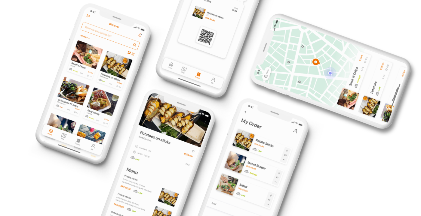
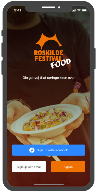
Welcome/Login screen
Home screen
Vendor menu screen
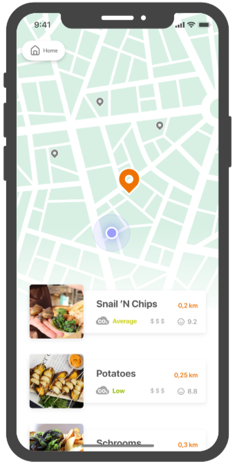
Map of vendors screen
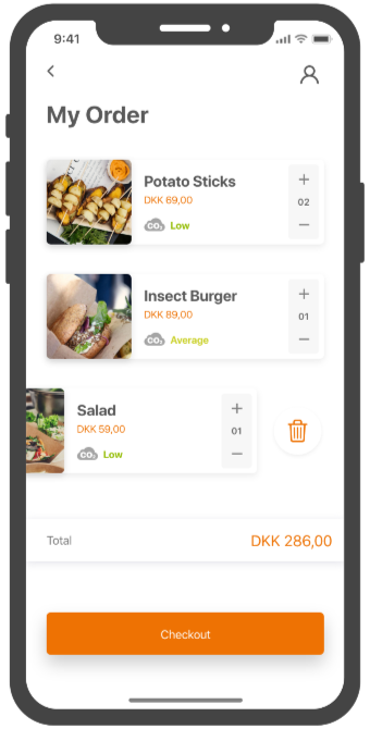
Cart screen
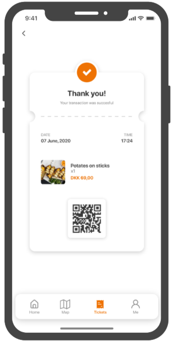
Receipt screen
The Process
Sketches
We used templates to generate lo-fi sketches on iPad to quickly get the ideas flowing. The main questions were:
How can we best present the food stalls in a user-friendly overview, and how can we best incorporate the visualization of the CO2 footprint?
Below is a selection of the many sketches that were created.
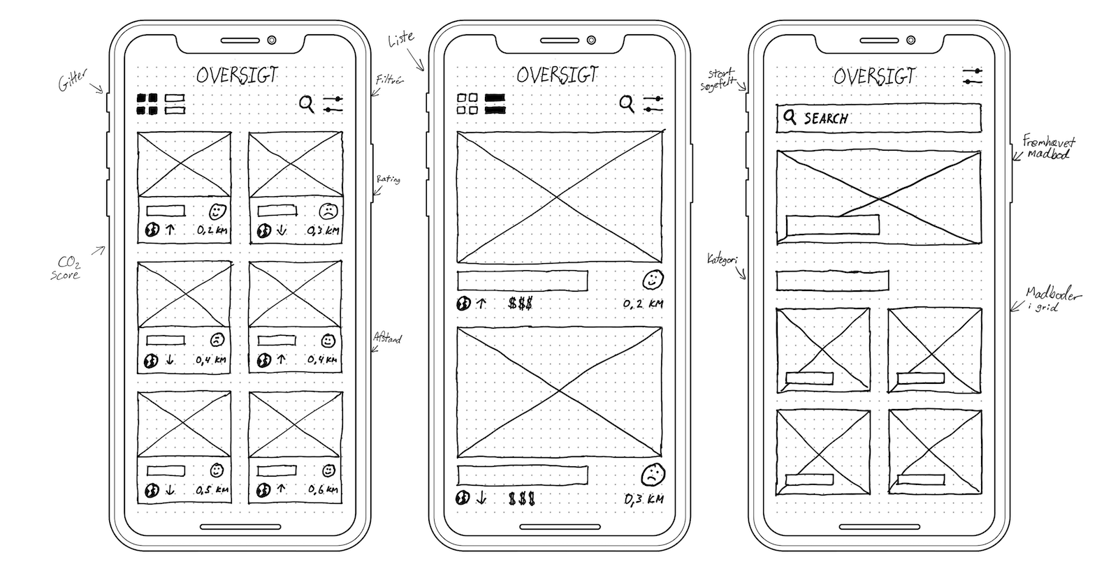
Sketches of list of vendors
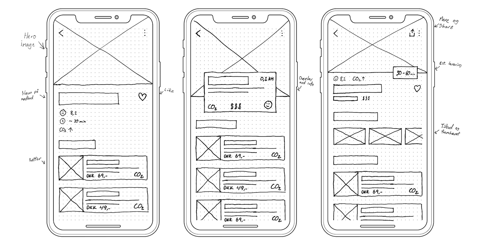
Sketches of vendor screens
Visualization of Climate Footprint
It was important for us that this solution not only provided users with the ability to order food and drinks but also be an essential part of the app, offering users an easy and clear way to navigate sustainable meals.
I was therefore assigned a task that involved visually conveying something as abstract as a climate footprint in a easily understandable and intuitive manner for the user.
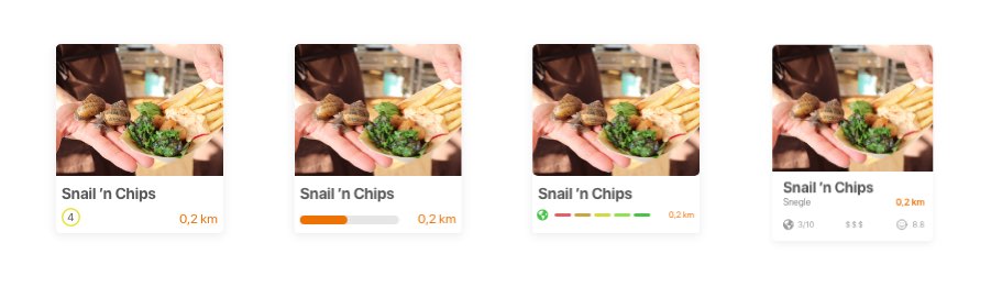
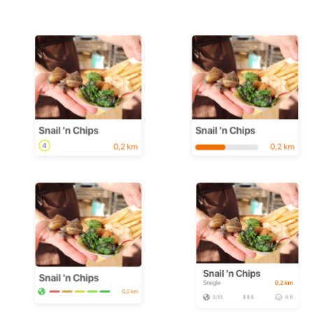
Iterations of the visualization of Climate Footprint
The CO2 icon
The fourth iteration with a CO2 score as a globe was used in our prototype and tested on the target audience. There was consensus among the test participants that it was not clear what the globe represented. Therefore, we had to further develop it.
I designed an icon consisting of a cloud with the word “CO2” and accompanying text describing the emission level, while the color of the text was meant to reinforce understanding.
“Low” became green to indicate that it was good, “Average” became orange, and “High” became red, making it clear that it was not good. This visualization proved to be much better and easier for users to understand compared to the previous version with the globe and numbers.
Comparisson
CO2 score as a globe
Numbers from 1-10 as a rating.
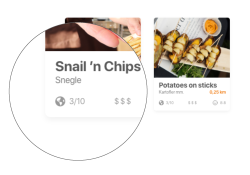

The test participants had difficulty deciphering the symbol and the numbers.
CO2 score as a cloud
“Low”, “Average” or “High” as a rating.
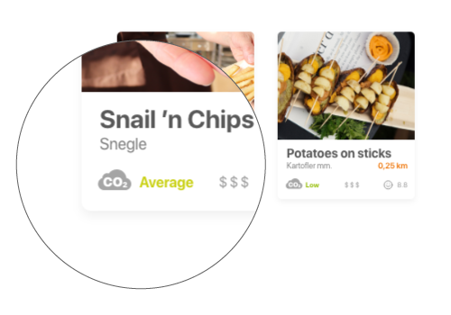

The test participants found it easier to understand the icon and text, and the colors made it easy to grasp what was good and bad.