
How we designed the ultimate 2D Replayer for professional CS:GO teams.
This is the story of how Skybox Battleroom evolved into Skybox EDGE. With its advanced 2D Replayer, Skybox EDGE empowers professional CS:GO teams to swiftly identify match patterns and execute winning tactics, giving them a decisive EDGE over their opponents.
Skybox Technologies
UI/UX Designer, Design System Manager
2022 – 2023
Chapter 1
Chapter 2
Chapter 3
Chapter 1
Design Audit and initial updates
Initial Review
In the UX and UI audit of Battleroom, several key issues were identified:
1. Icon Size: Icons were too large, overpowering the content. They need to be reduced to support, not dominate, the interface.
2. Alignment and Spacing: Inconsistencies in alignment and spacing created a cluttered appearance. Implementing a consistent grid system would improve organization and readability.
3. Contrast and Colors: The contrast in scale and color was either too extreme or too subtle, leading to a lack of balance. Adjusting these elements will enhance visual harmony and accessibility.
4. Visual Hierarchy: Poor visual hierarchy made it difficult for users to focus on key actions. Refining this hierarchy will guide users more effectively.
5. Clarity and Focus: The cluttered design distracted users from their tasks. Simplifying the interface will improve clarity and usability.
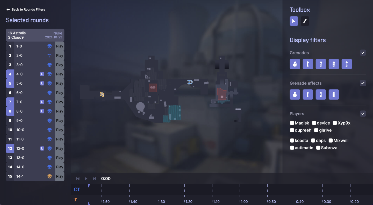
Skybox Battleroom as it was when I arrived.
Design audit
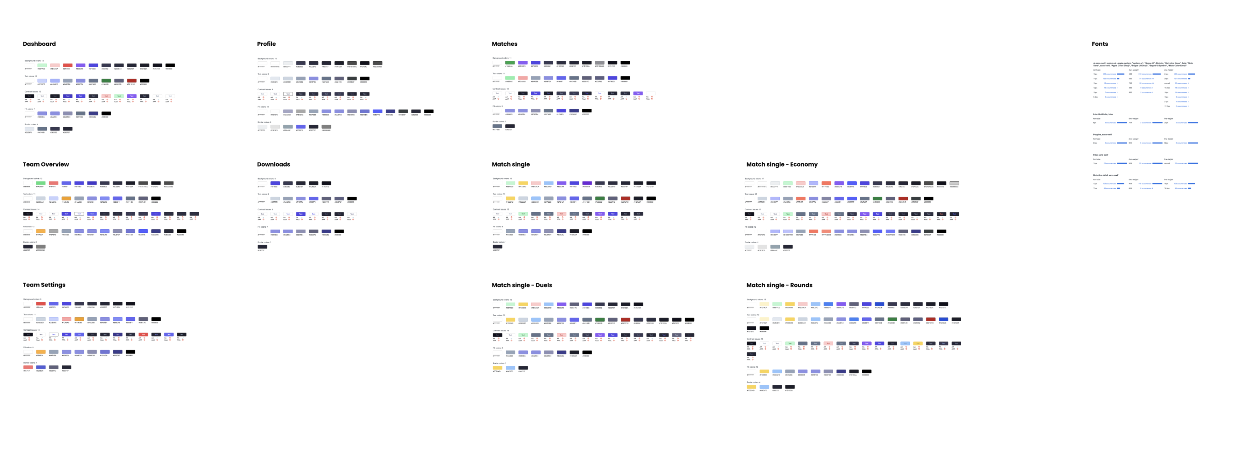
Colors from the Battleroom design audit.
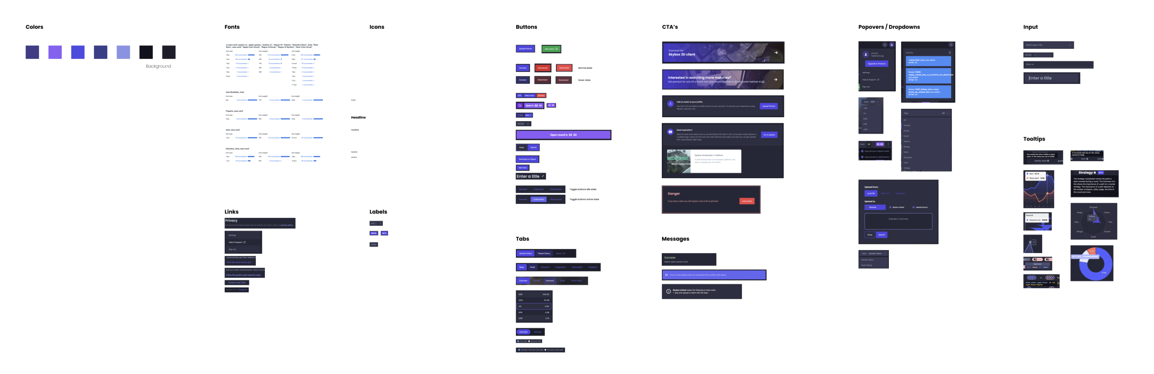
Variations in components from the design audit of Battleroom.
New color palette? – yes, please!
I used Figma to quickly create mockups of the platform, experimenting with different color palettes, text styles, and spacing. This process served as a creative playground where we could rigorously test and iterate on different designs, ultimately helping us refine and finalize the style guide to ensure it was both visually appealing and user-friendly.
We refined the color palette by selecting the most essential colors from the existing design. The result was a thoughtfully curated color palette, which included Indigo as the primary color, Slate as the secondary, Orange as the accent, and Red and Green for destructive and confirmation actions, creating a cohesive and intuitive visual identity.
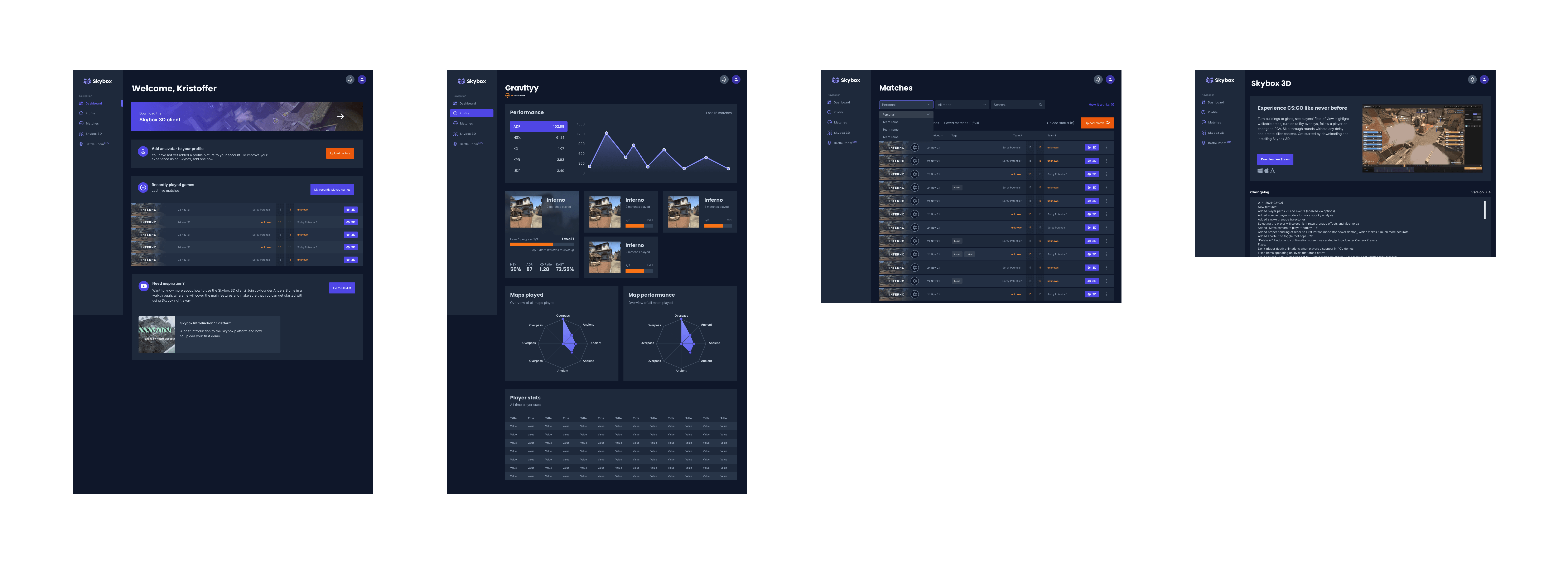
Mockups of Battleroom with new color palette applied.
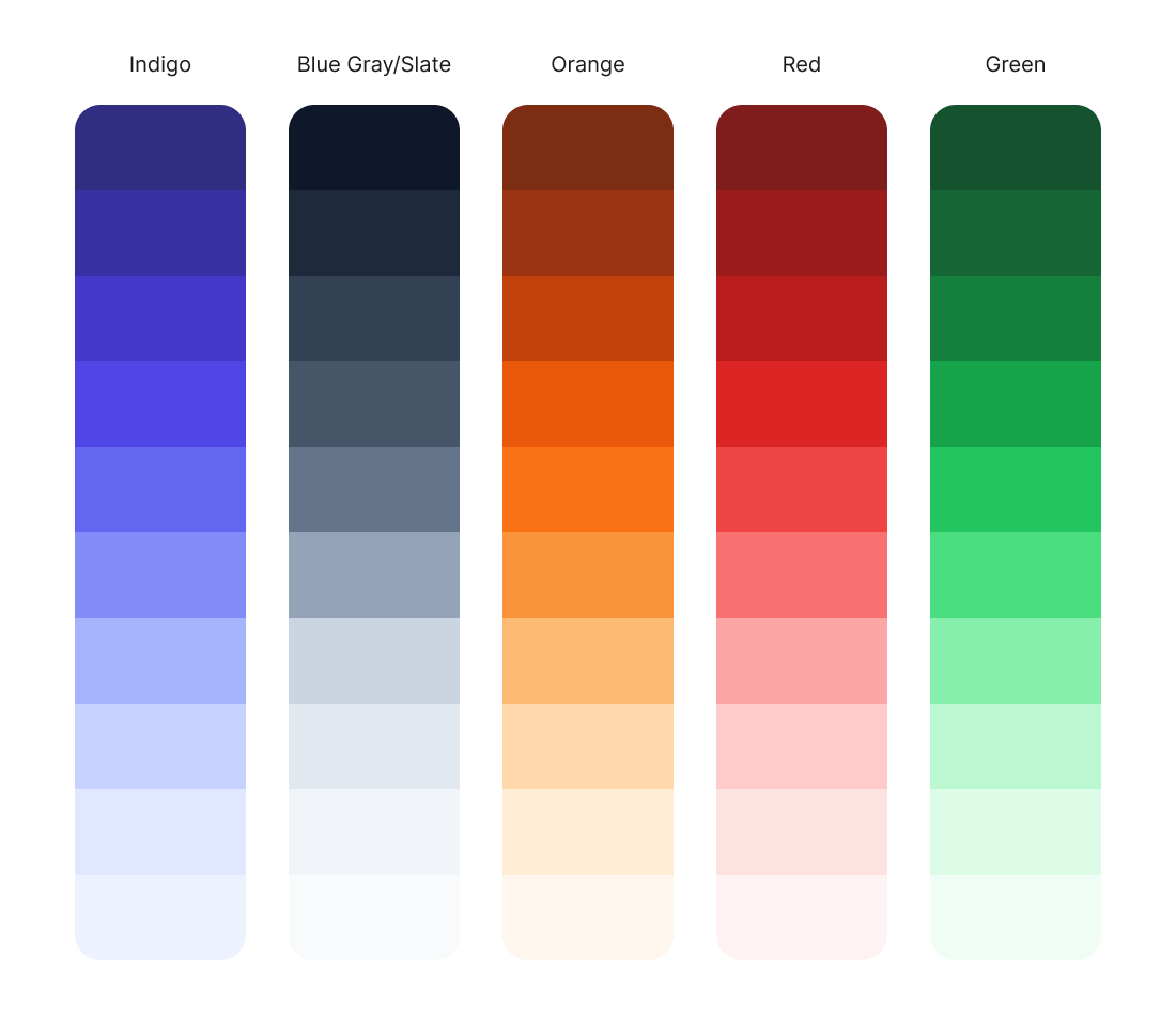
New color palette.
A birds eye view
Wireflows were created to map out user journeys and interactions, giving a clear overview of navigation and connections between screens. These wireflows offered a high-level view of user navigation, illustrating connections between components and key decision points. This approach helped us spot usability issues early and refine the user experience, ensuring the design was intuitive and efficient for a polished, user-centric final product.
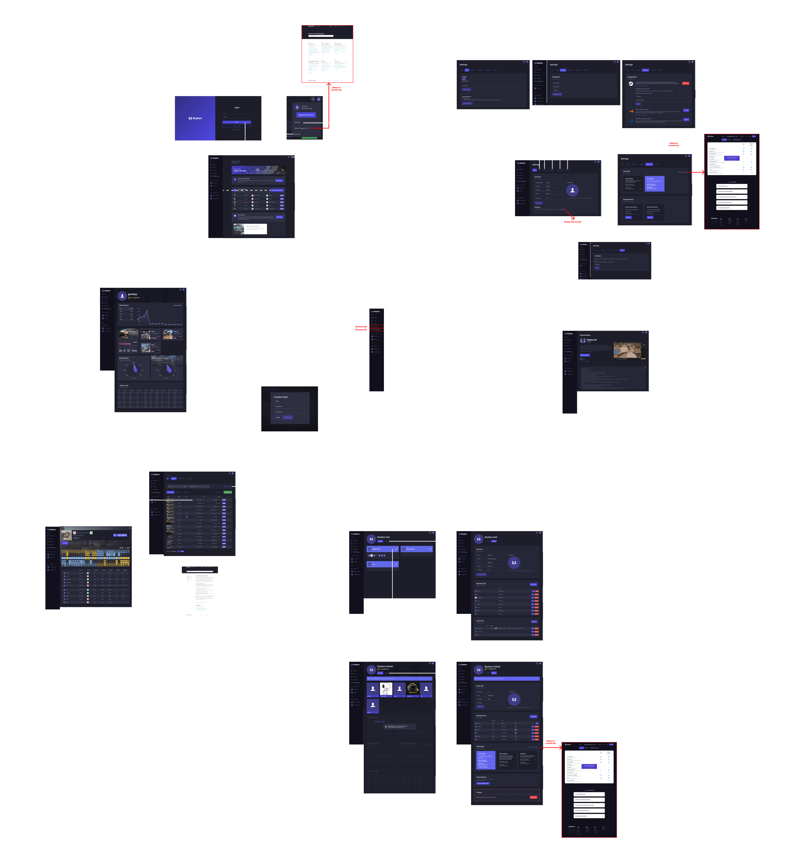
Wireflow of Skybox Battleroom.
Chapter 2
Rebuilding the 2D Replayer for valorant
Objective
Our mission was to extend the capabilities of Skybox Battleroom to support Valorant, the popular tactical shooter by Riot Games. We were given a stringent one-month deadline to accomplish this: two weeks for design and an additional two weeks for development and further iteration.
Iterations and Prototype Development
We began by developing initial prototypes that concentrated on key functionalities essential for Valorant integration, such as player tracking, round overviews, and event visualization. These early prototypes were designed to explore and validate the core features, allowing us to gather feedback and identify areas for improvement.
Each iteration built upon the previous version, incorporating insights and adjustments based on user testing and stakeholder input. This iterative approach enabled us to refine the functionality and user experience continuously.
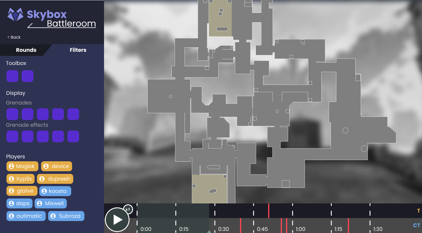
Version 1 of the Valorant 2D Replayer.
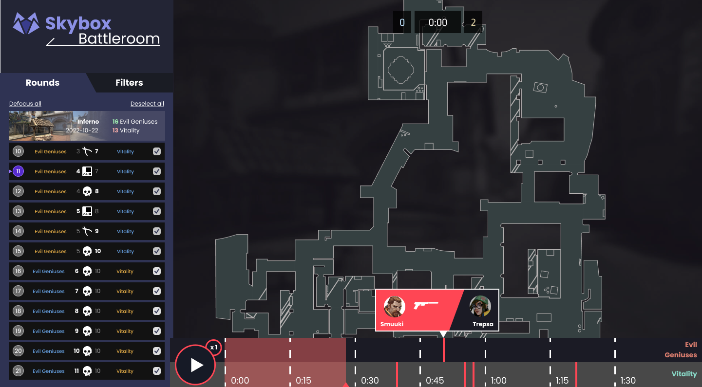
Version 2 of the Valorant 2D Replayer.
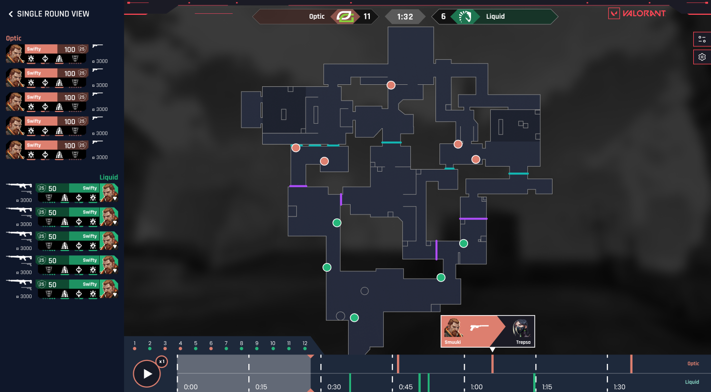
Version 3 of the Valorant 2D Replayer.
Components and Handovers
We designed each UI element as a component, allowing for efficient iteration and maintaining consistency across the project. This modular approach ensured quick updates and a cohesive structure, reducing redundancy. During handovers, the use of well-documented components streamlined communication with developers, making it easy to implement and scale. Aligning components with the development framework ensured a smooth transition, saving time and reinforcing design consistency throughout the project.
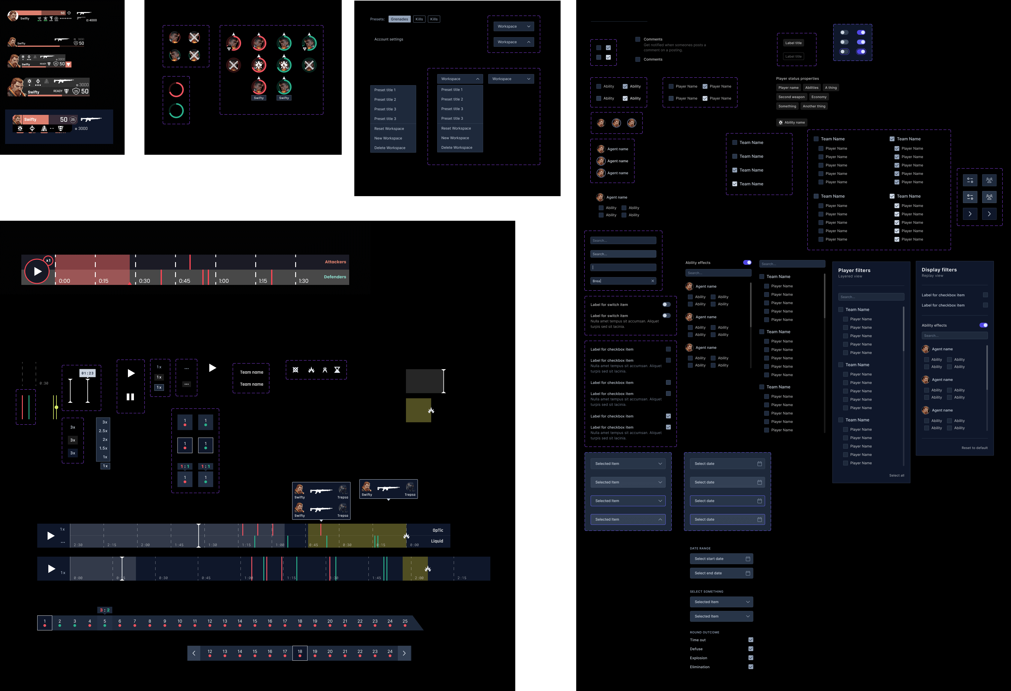
Selection of components for Battleroom Valorant.
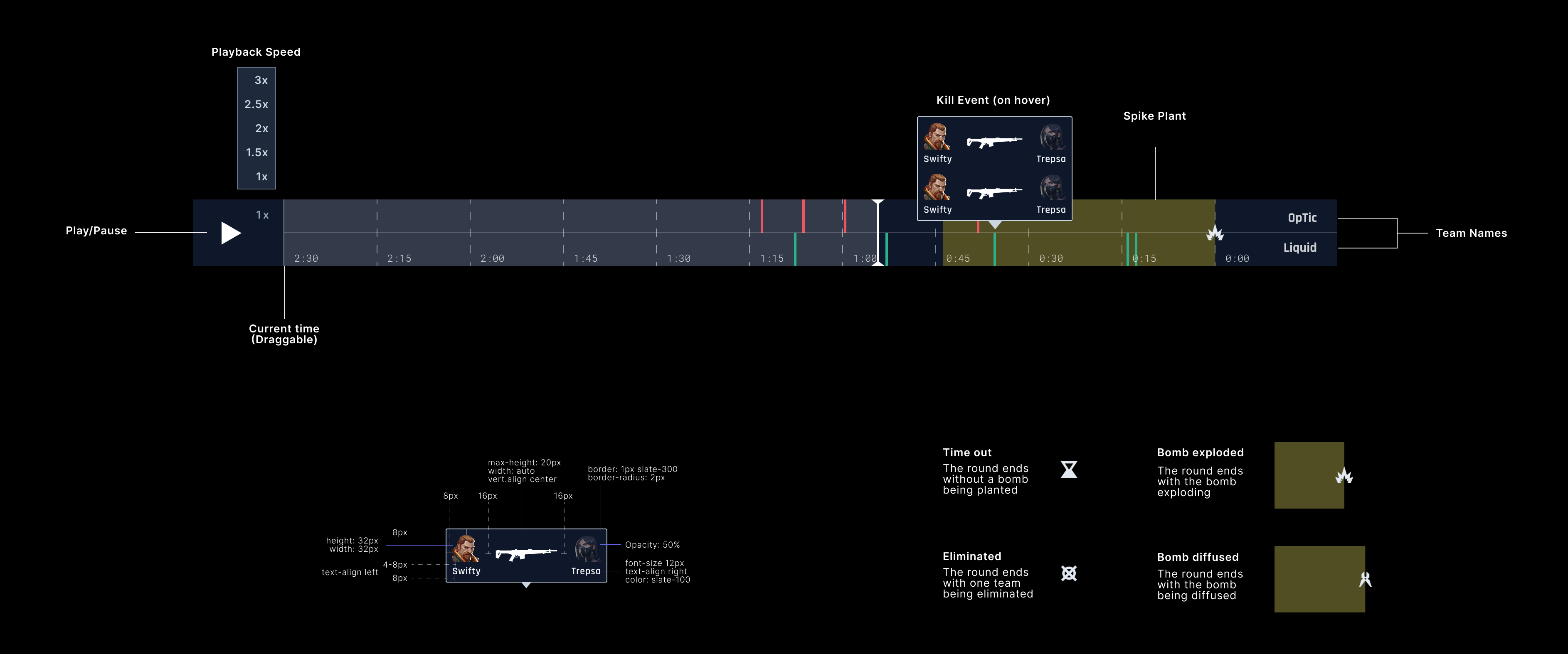
Example of a component handover attachment.
Final Design of Battleroom for Valorant
Beyond meeting the initial user requirements, the final design surpassed expectations by offering an intuitive and immersive user experience. We refined every aspect based on feedback, ensuring the integration not only fit seamlessly into the existing platform but also provided valuable insights and enhanced the analytical capabilities for Valorant teams. This comprehensive solution elevated Skybox Battleroom, making it a more powerful tool for esports professionals.
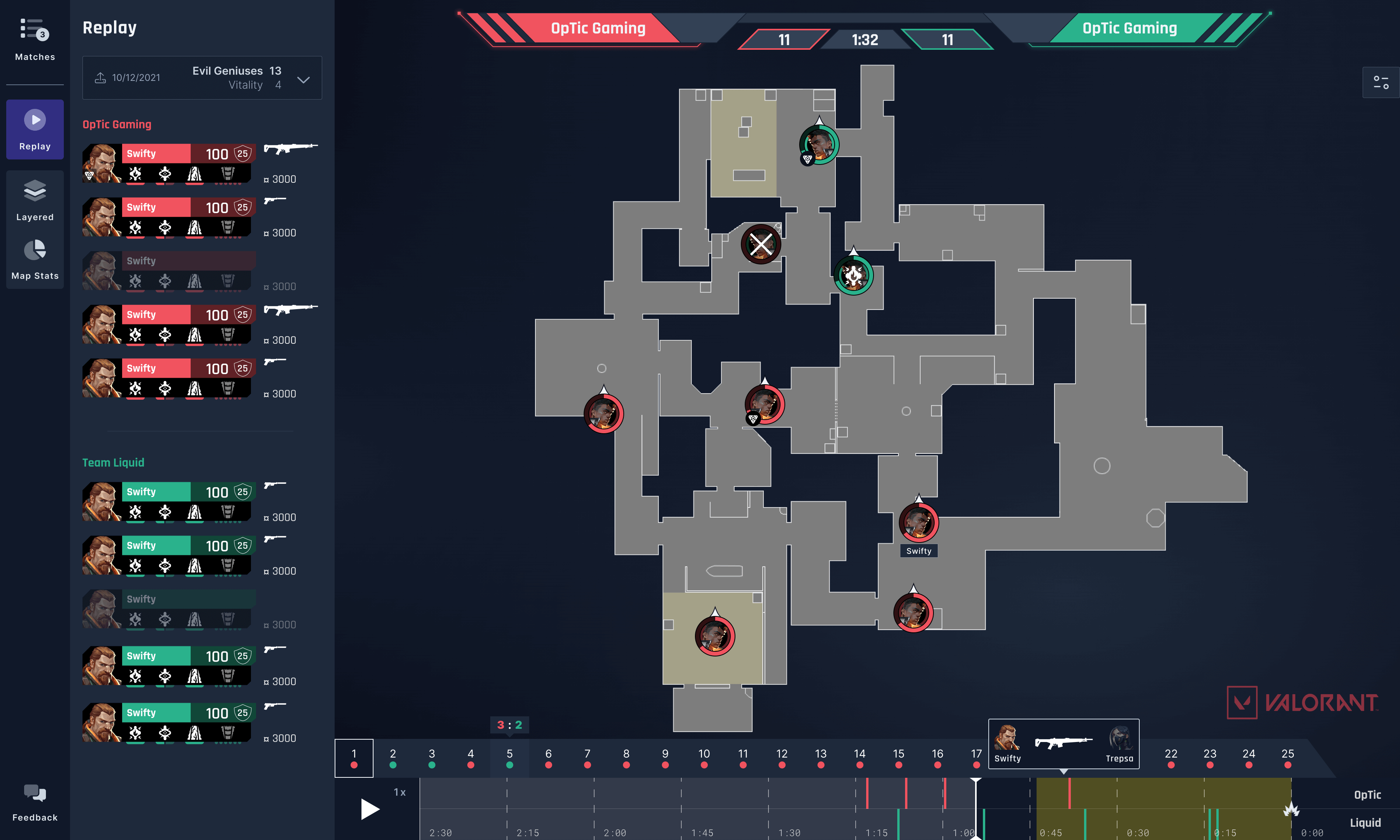
Shipped version of the Valorant 2D Replayer.
Chapter 3
The creation of Skybox EDGE
User Journey Mapping
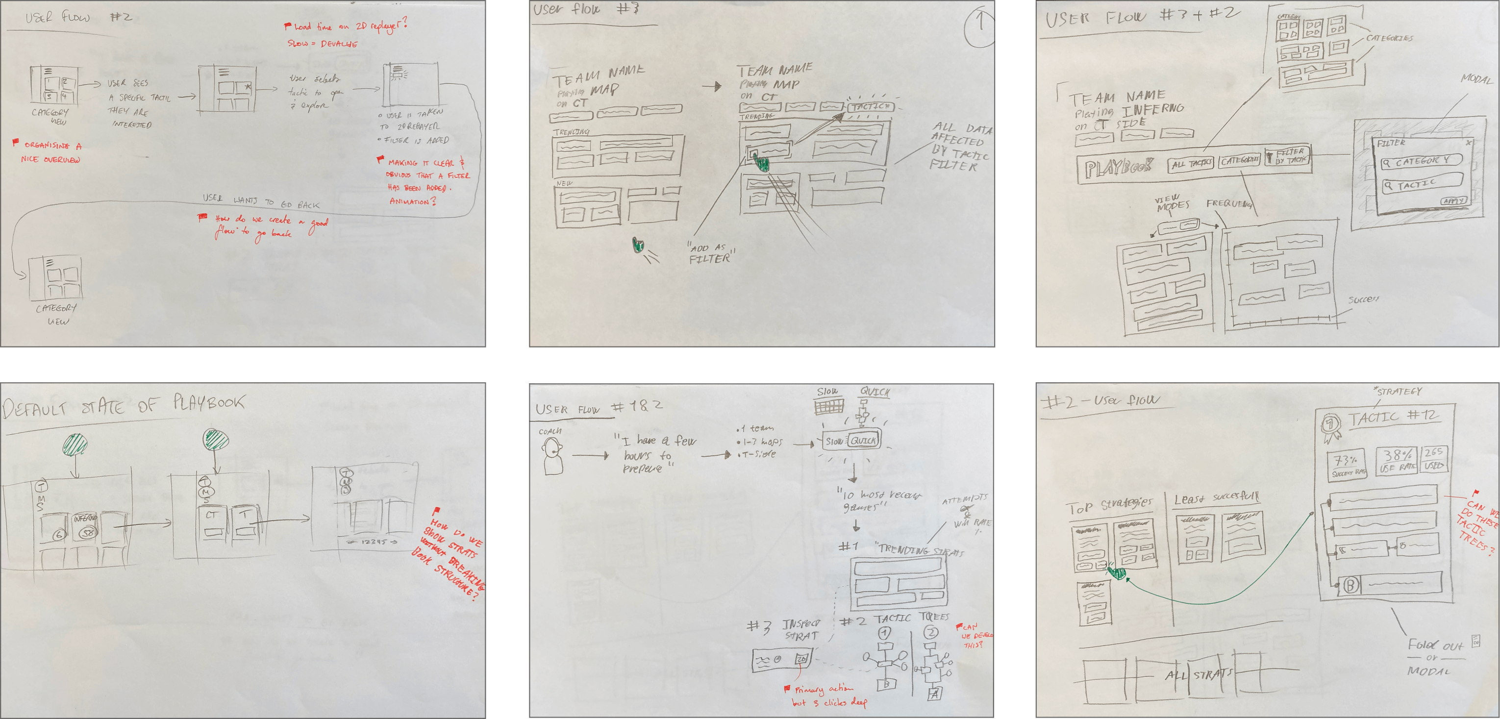
Sketches of user journeys.
Low-Fidelity Wireframes
We developed a lot of low-fidelity wireframes to establish the overall layout and key interaction flows. These wireframes acted as a blueprint, focusing on information architecture and user journeys without visual distractions. They enabled rapid iteration, allowing us to test and refine navigation patterns and interaction touchpoints early on. This ensured the design aligned with user needs and business goals, creating a clear, user-centered foundation for the final interface.
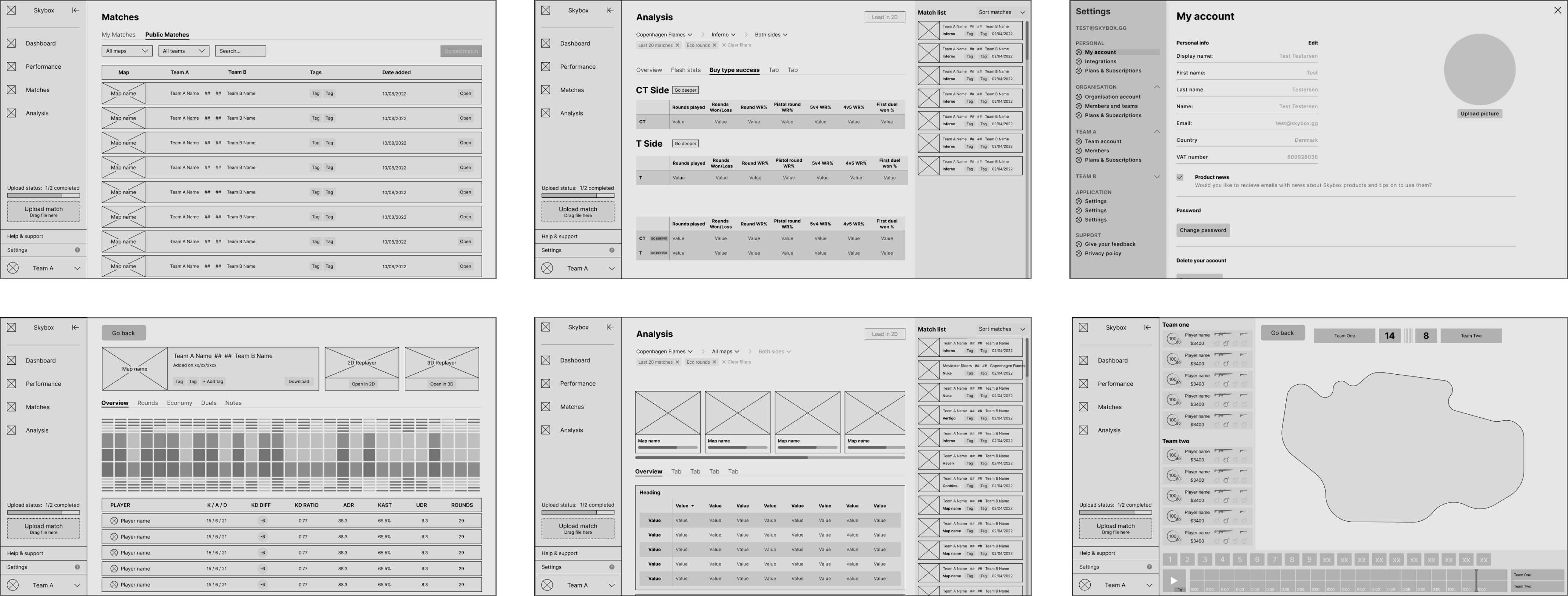
Lo-fi wireframes.
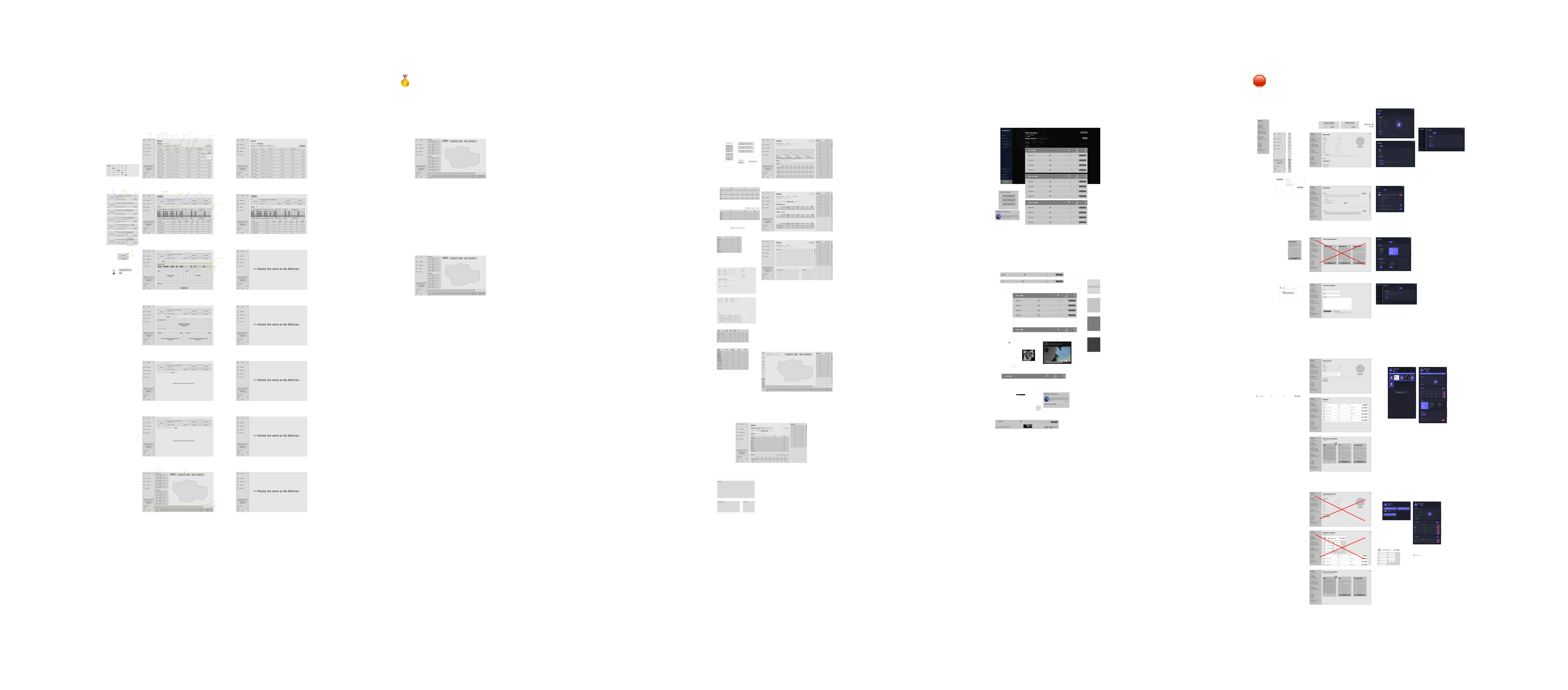
Lo-fi wireframes – organized by product area.
High-Fidelity Wireframes
We transitioned to high-fidelity wireframes, incorporating user and stakeholder feedback to refine UI components and micro-interactions. These wireframes provided a pixel-perfect representation of the interface, focusing on visual hierarchy and interaction patterns. By offering a clear guide for developers, they facilitated a smoother handoff between design and development by detailing interaction states, responsive behaviors, and visual consistency. This level of fidelity ensured that the development team had a precise guide for implementation, minimizing discrepancies and reinforcing a seamless user experience across all touchpoints.
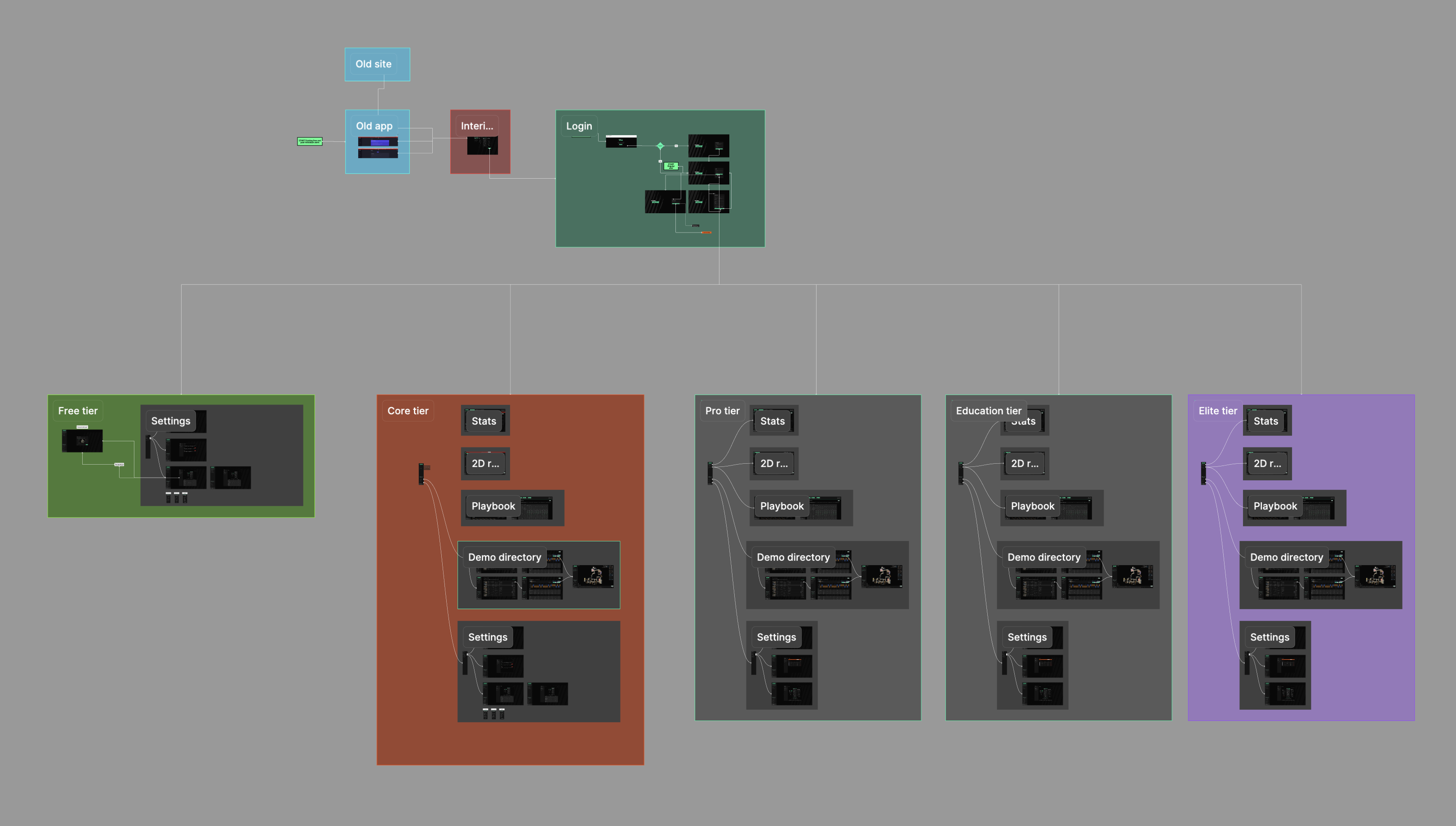
Hi-fi wireframes – organized by subscription tier and wired by primary user-flow.
Component structure
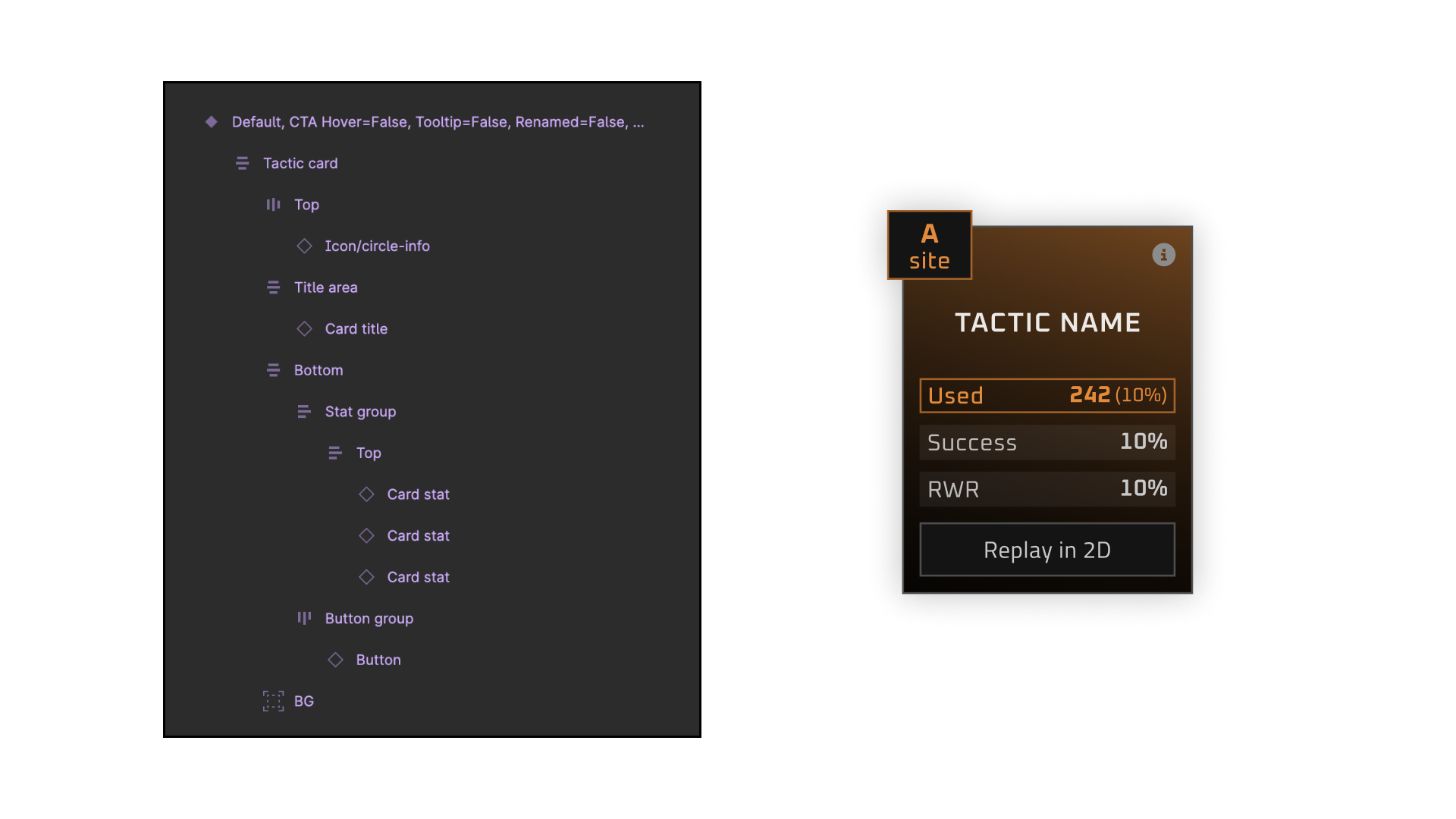
The component and how it’s layered with names and structure.
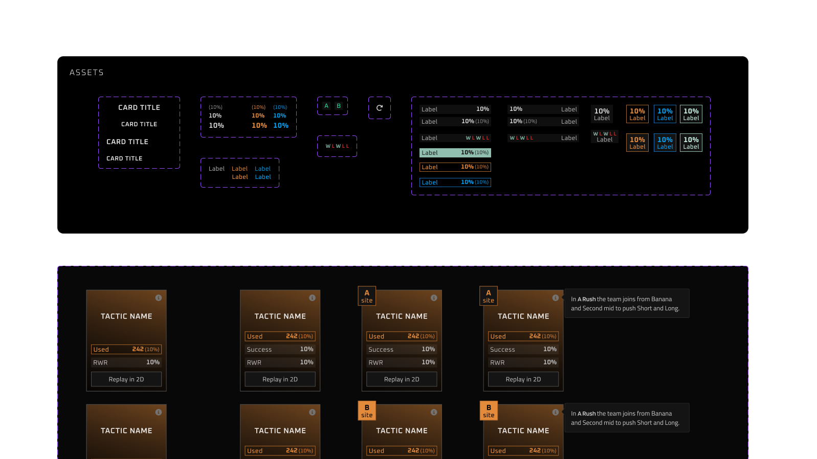
The component and its subcomponents are organized as assets in the design system.
Animations
Round Switcher
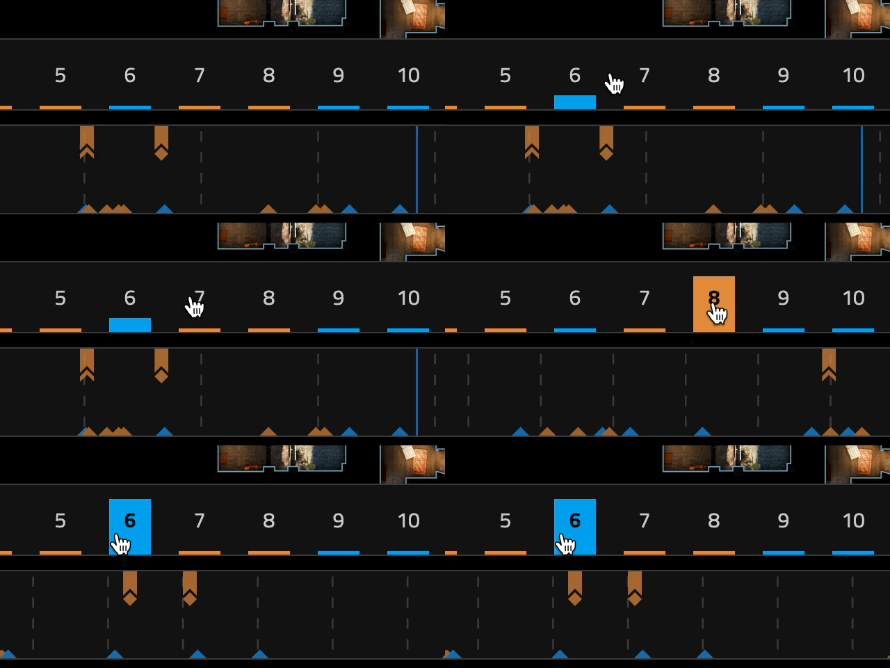
Playful round switcher animation.
Hit Damage
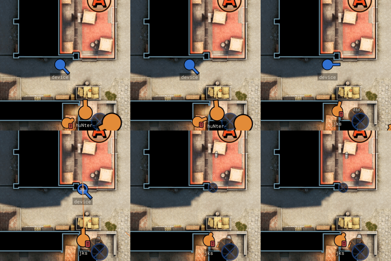
Player dots on the map shows real-time hit damage.
Clarity at a Glance
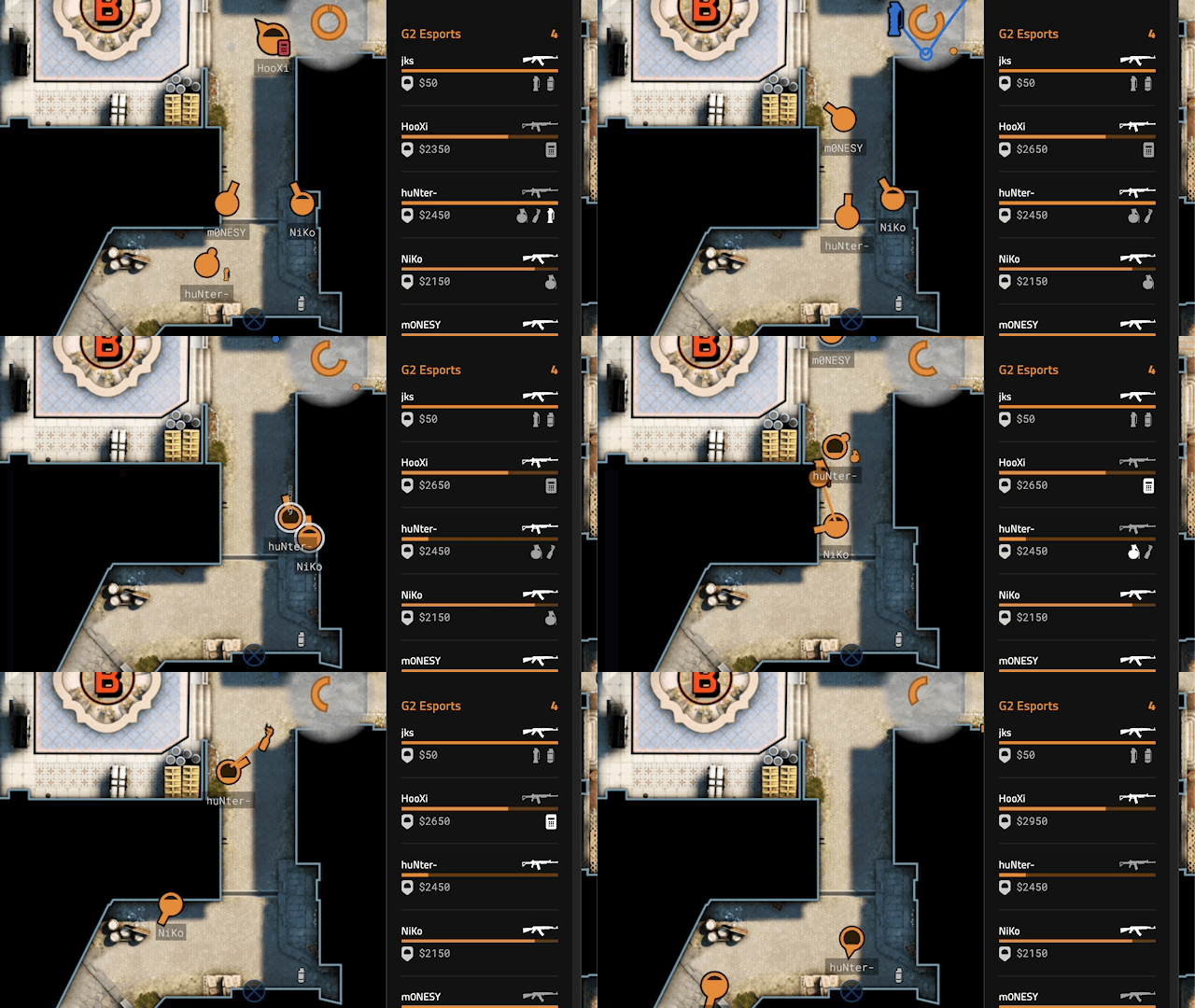
Player sidebar information at a glance.
Iterations on the Player Status Element
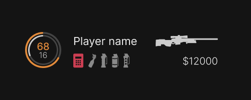
Iteration of the Player Status Element.
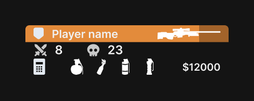
Iteration of the Player Status Element.
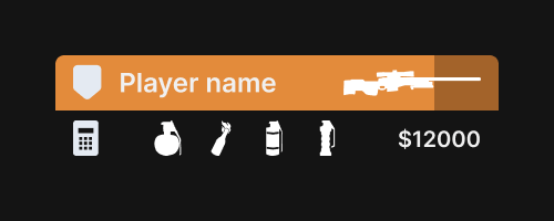
Iteration of the Player Status Element.
Final design of the Player Status Element
- Easy to read and scannable player names.
- Less focus on the exact health amount.
- Higher focus on active weapons and utility.
- Bomb and defuse kits stand out and are easily scannable.
- Monospaced font for the economy.
- Minimalistic design to avoid visual clutter.
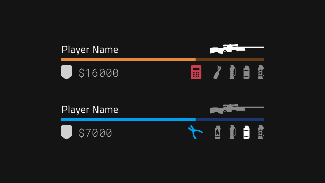
Final version of the Player Status Element.
Iterations on the 2D Replayer
We went through multiple iterations of the 2D Replayer, refining its features and layout over time. Each version was tested extensively with top-tier Counter-Strike teams during a prolonged alpha testing phase. This hands-on feedback from elite players was invaluable, allowing us to continuously tweak and improve the replayer. Through this iterative process, we honed in on the final version, ensuring it met the high standards and specific needs of professional teams before it was fully launched.
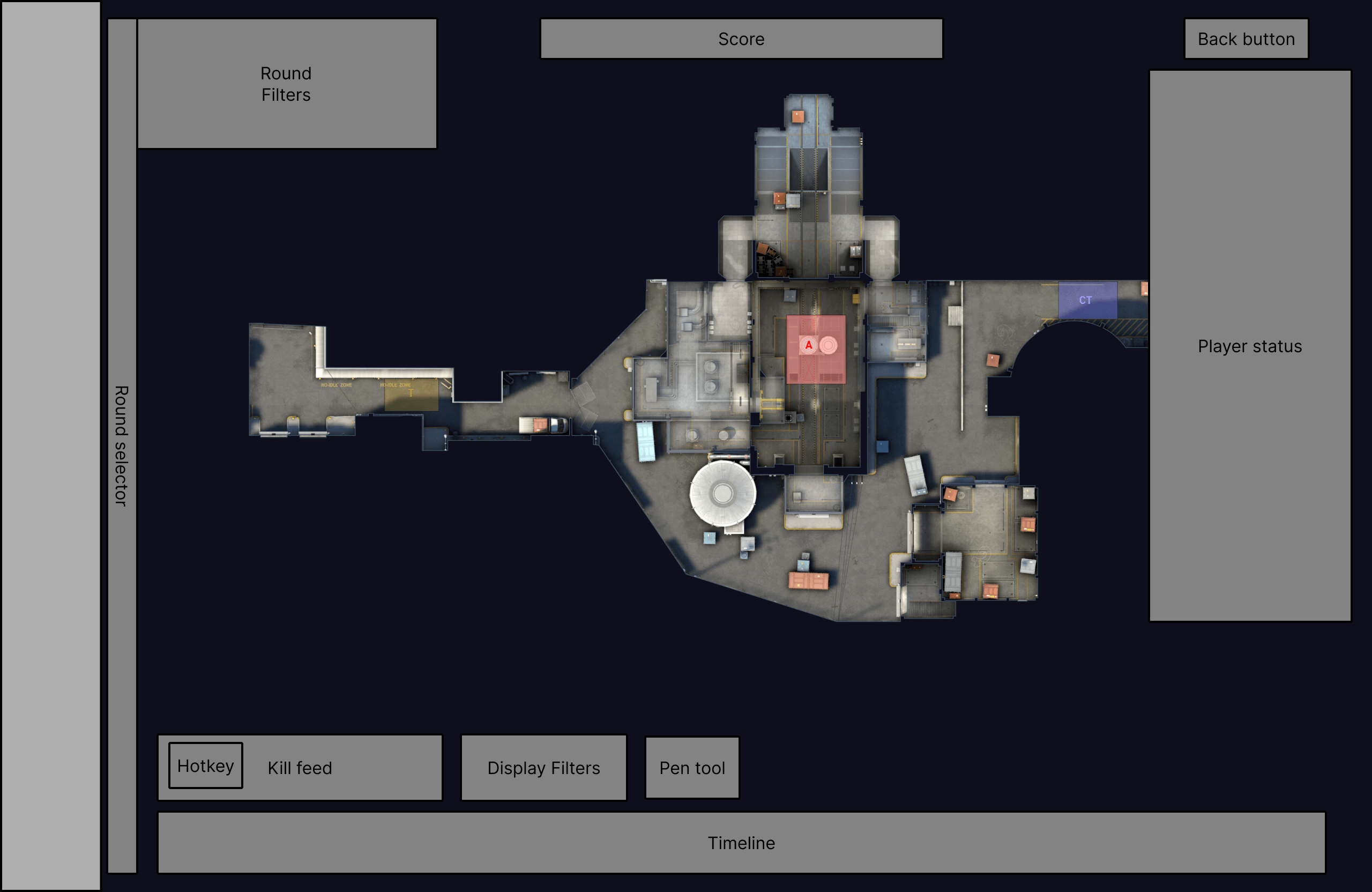
Wireframe of EDGE 2D Replayer.
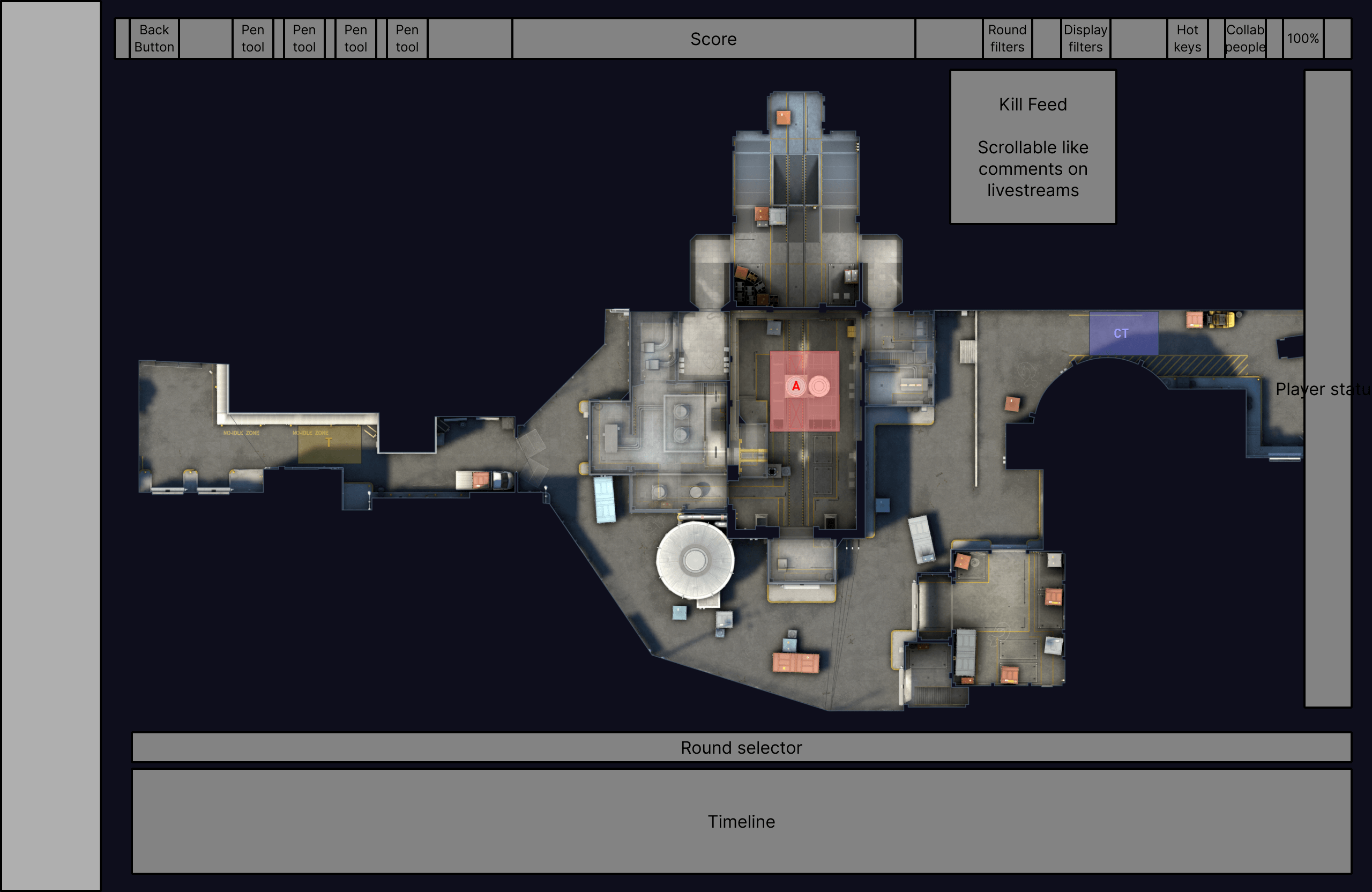
Wireframe of EDGE 2D Replayer.
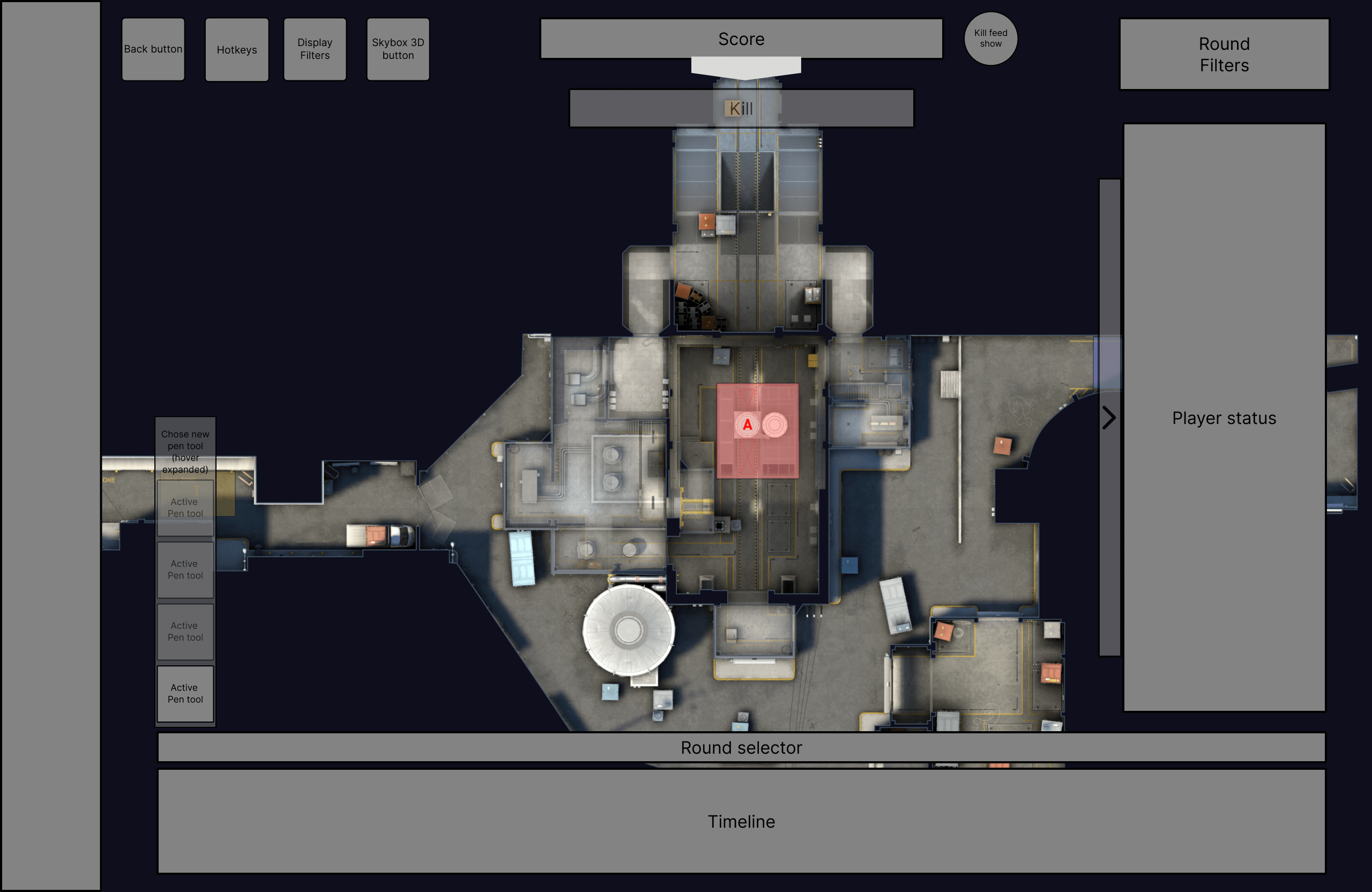
Wireframe of EDGE 2D Replayer.
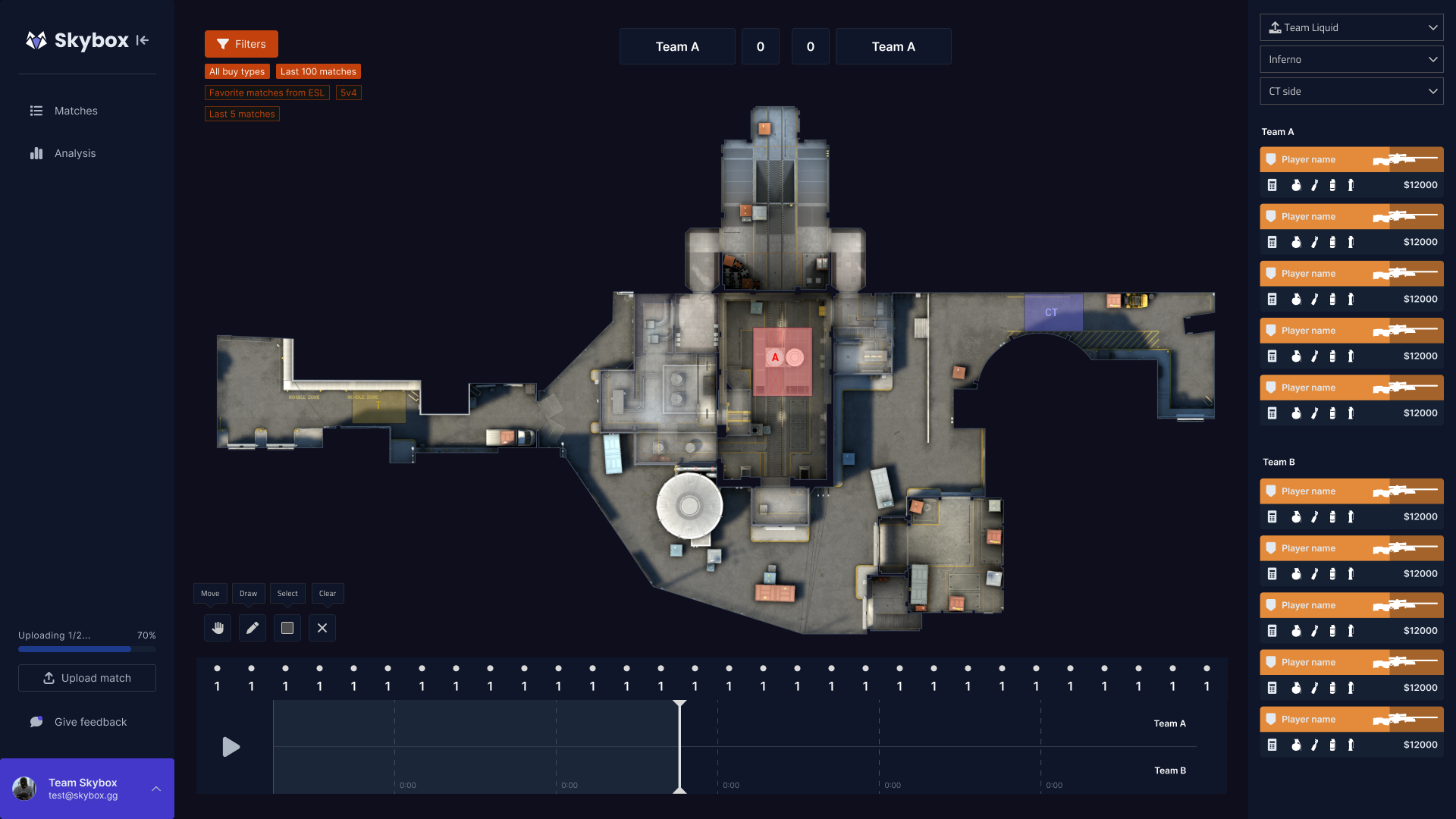
Iteration of the EDGE 2D Replayer.
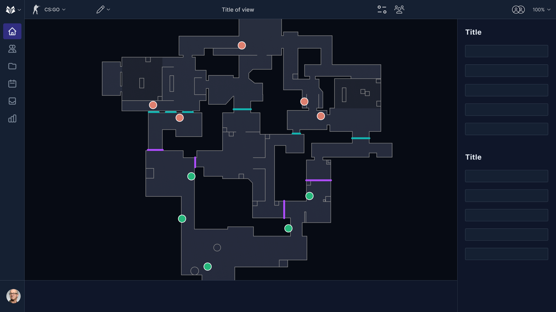
Iteration of the EDGE 2D Replayer.
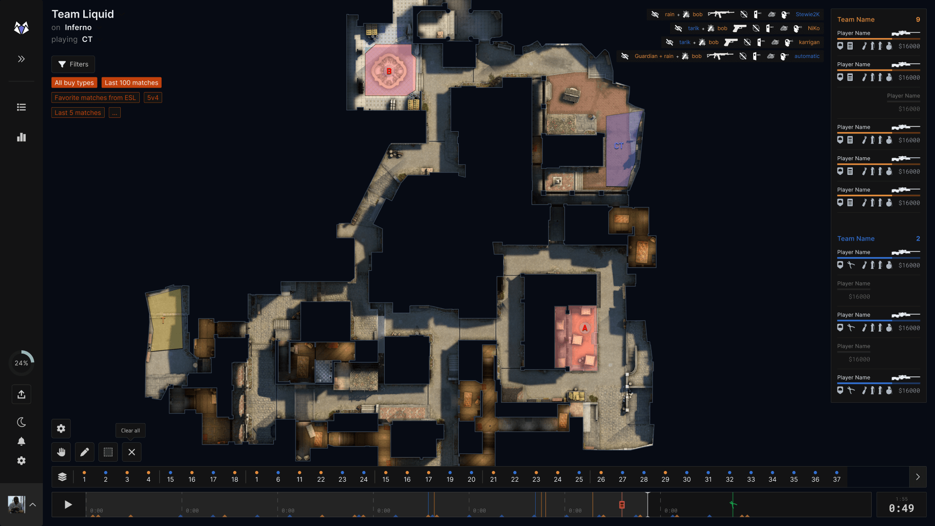
Iteration of the EDGE 2D Replayer.
Final version of the Skybox EDGE 2D Replayer
Featuring a dark theme to minimize eye strain and high-contrast elements to highlight key information, the final design of the EDGE 2D Replayer uses a clear visual hierarchy with the map overview prominently displayed and essential tools easily accessible.
The design balances information density with clarity, placing interactive elements like the timeline and round markers for ease of use. The left sidebar’s familiar icons facilitate quick navigation between analysis modes, while customizable and filter options are available in the top left corner without cluttering the interface.
The right-side player stats panel offers quick, intuitive access to information. By grouping related functions and using consistent color coding, the design reduces cognitive load and supports efficient task completion. Integrated filters and viewing modes streamline the analysis process, making the tool intuitive and effective users.
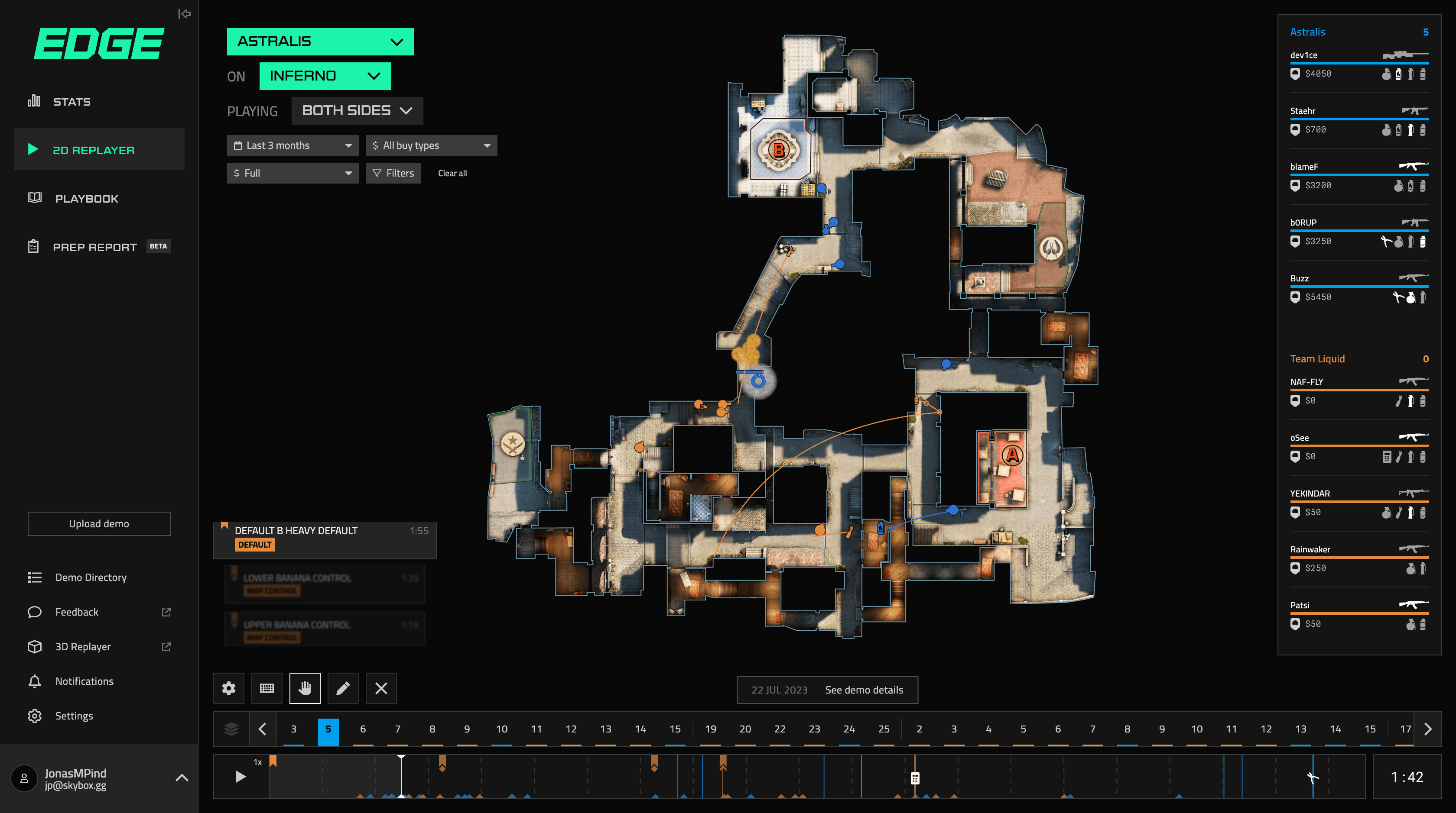
Final version of the Skybox EDGE 2D Replayer.
Key Takeaways
1. User-Centric Design as a Foundation
My design process for the Skybox EDGE 2D Replayer was deeply rooted in understanding the users. Through comprehensive user research and continuous feedback loops, we were able to craft solutions that addressed real user pain points. This user-centered approach drove every design decision, ensuring that the product was both intuitive and enjoyable to use.
2. Importance of Agile Iteration
Iterative design played a critical role in the project’s success. By continuously testing and refining features, we ensured the interface not only met user needs but also evolved as the project grew. Each iteration allowed us to make data-driven adjustments, leading to a polished final product.
3. Cross-Team Collaboration is Key
A major takeaway from this project was the value of cross-functional collaboration. Working closely with developers, product managers, and stakeholders allowed us to bridge the gap between design intent and technical execution. This collaboration ensured that the final output aligned with both user needs and business objectives, and was feasible from a development standpoint.
4. Scalable Design Systems
Designing with scalability in mind was crucial for the EDGE Replayer. By developing a flexible and consistent design system, I enabled the team to maintain visual cohesion across all touchpoints, while also allowing for future feature updates and expansions. This approach minimized design debt and ensured long-term consistency.
5. Accessibility and Responsiveness as Non-Negotiables
Accessibility and responsiveness were integral parts of the design strategy. I made sure to adhere to accessibility guidelines, ensuring that the platform was inclusive for all users. Additionally, the product’s responsive design ensured a seamless experience across devices, further enhancing usability.
6. Balancing Aesthetics with Functionality
A key learning from this project was the delicate balance between creating a visually compelling design and maintaining functionality. While the UI had to be aesthetically appealing, it was essential to ensure the user experience remained intuitive and efficient. By balancing form and function, I was able to deliver a product that not only looked good but also worked effectively.
These takeaways reflect my approach to design: always user-focused, data-driven, and collaborative, with a constant eye on both current needs and future growth.